I recently read
Draft no. 4 by John Mcfee. Sometimes I read about writing because there is so much I missed learning early on in life and yet so much of modern life is writing in one form or another, I should know what is going on, or at least know what people are talking about when referring to tenses and sentence structure etc at parties... people talk about that sort of thing at parties right? It's been a while (even before the pandemic I'm not exactly a socialite). Anyway, it's not at all the type of book I was expecting (
Zinsser, Strunk & White) but is really enjoyable nonetheless

When I finished the penultimate essay also entitled Draft no.4 (easily one of my favorites.) and it got me thinking much about the challenge of completing a project. Especially when you see some people cranking them out. and a light bulb moment sort of appeared to me.
I tend to always just do the rough draft of any project, since I'm typically doing a new design of my own, and doing the first piece largely as the prototype but also the finished piece.
This presents issues like
- Being uncertain of the sequences of operation, circling analysis paralysis in order of operations discussions. This is reminiscent of writers staring at the blank page not knowing where to start.
- Making tentative or conservative decisions about strength (typically too heavy) shaping (can't put material back) or stylistic lines which can mean you end up with designs that might work but not live up to it's full potential. (boxed words)
Contrast this with people who make lots of the same thing or writers & comedians honing their flow.
- Because they have a working process, their minds don't need to be cluttered with anxiety about what happens when etc.
- They are familiar enough with the variables to know what to mix up for the next round.
One of the key concepts is to get a rough draft and move on, but what is the rough draft in furniture making? A sketch, a drawing, a model, a prototype, all of these are similar to, but not really the same as the item (The map is not the territory)? In woodworking, how do you go back and wholesale edit it top to bottom? a completely new piece? that seems like a lot of work. I guess the effort involved could very much resemble retyping a draft in the days before computer.
A further concept I like from McFee's essay is the idea of "boxing words" when you find something that is really "almost there" in a draft and a little tweaking might make it great. I think there are a couple of details that to my eye have this potential, in particular, the "knuckles"
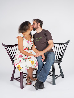
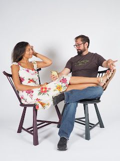
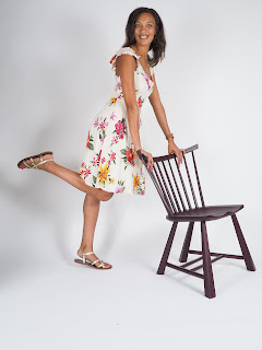
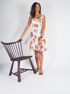
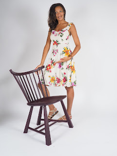
Another aspect that makes sense in both writing and woodworking is employing a good copy editor to evaluate your work and help to clarify an element or eliminate chaff (So with this chair I've been trying to get other people to sit in and critique, super easy during a pandemic.)
This first chair sat for a long time weighing on this "one true chair" concept that I would be finishing it and and I would be a chair maker (full stop) (This was stupid.) During this build, there were things that went sideways. (wood irregularities, splitting...) and once it became "unrecoverable" in perfection terms, it took away that anxiety, since I was just barfing out a "rough draft."
How I got here (the backstory)
Things I tried on this project
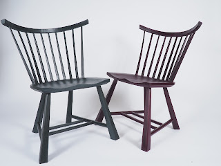
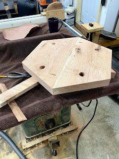
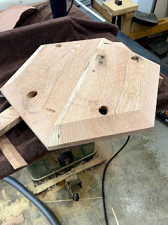
 The legs are twisted/smushed hexagons. they go from a circumscribed hex to a smaller inscribed hexagon (rotated 60°) at the top. this means the middle section are actually octagons. It's a bit tricky to visualize at first but actually easily executed with hand tools. This provides a hex on the floor, but doesn't look like a pencil along it's length. in part because it's hard to go against this comment from that last referenced blog
 - "pfollansbee says:February 8, 2015 at 5:49 pm Octagons. there’s a reason you never see legs that are hexagonal. a.) they’re stupid. b.) they’re ugly. Huh. two reasons. says me, anyway. Otherwise, I like smaller. The chair will look better."

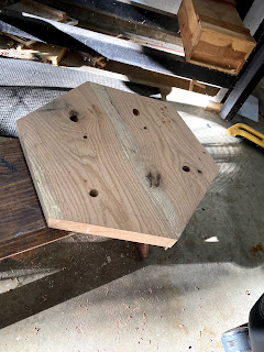
- The hex Seat actually provides a nice shape to sit in. rather than thinking about it as a point added, think about it as the corners are removed allowing less thigh pressure.
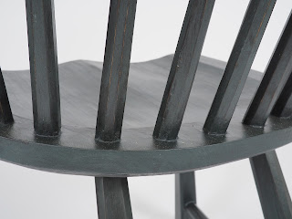
- I evenly spaced spindles in the deck to maintain the mathematical regularity
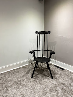
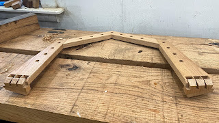
- The angular arm rail formed by bridle joints. pinned with the spindles
- The exposed dovetailed "knuckles" So far this has been everyone's favorite detail
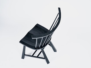
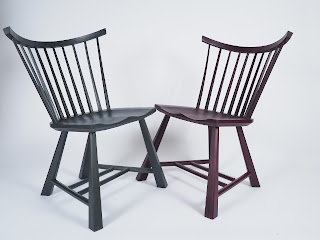
- The crest rail is V-Shaped rather than bent
Things I learned
- My love affair with shousugiban is coming to a close. I still love the color and texture it leaves, but the added complexity of sequencing sizing parts/joining/shaping/finishing/glue ups has gotten old on complex projects. this may be one of my last complex projects with this finish.
- My legs are still kind of fiddly to fit to get just right and yet largely indistinguishable in the finished product from dead simple octagons, might not be worth the extra work in practice.
- The wide V-backrest base does cradle the back effectively.
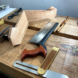
- Angled tapered dovetails in the crest rail was tricky for my mind to ponder in layout & execution, but also fun to try.
- shaping the crest rail was actually pretty easy and fun once the joinery was correct.
Things I'll do differently on the next draft
- I'd like to make this in walnut, I think it would be a good fit visually
- Legs will be a bit thicker to add more weight at the floor benefitting visually there.
- Use 2 fewer spindles in the back to accentuate the elongation of the chair shape and perhaps improve the head rest feel.
- The spindles could use something more "angular" in some way. the round dowel spindles are fine, but I feel like something could be done to enhance the look somehow perhaps tri-lobed with the soft flat face towards the user..
- Work a bit tighter on the inset hex line on the seat.
- on the armrest section that touches the back lean it back to match the spindle angle. This will reduce the edge contact to the sitter.
- I may make the crest rail connection a miter with splines to guarantee the tight joinery I desire.
- The arm spindles "lean" in the wrong direction to my eye from the side view. I'd like to reconfigure that a bit to make it lean the other way (or at least I think I do)


